

|
|
|
|
 |
JLabel is a simple component that displays a single line of text, an icon, or both. It is designed to be source-compatible with java.awt.Label.
JLabel is a member of a family of five components that can display a label consisting of either a icon, a single line of text, or both:
To keep life simple for developers, it's important that all these components support the same API for both text-related and icon-related properties. An API for these properties must allow the developer to specify the relative positions of the icon and the text, as well as their overall position within the component. For example, the developer should be able to specify that the text of a label is to appear to the right of a icon, and that the composition of the two is to appear right-justified within the button.
A little bit farther out, but still within the bounds of the current crop of Java toolkits, is support for more precisely controlling the layout of the label, and for animating the label. Check out this year's version of TurboTax for a nice example of the latter.
This flexibility can't be achieved at the expense of complexity in the basic API, and it can't be defined in a way that's fundamentally incompatible with the current AWT API. In other words, if you want to create a button with a centered label, or a label component that contains some right-justified text, you should be able to do that in the same way you always have.
Here's a list of the features of the JLabel class. This same list of features applies to the other components that bear a label:
JLabel has no model. The JLabel.getModel()
method returns null. Implementations of LabelUI are expected to draw disabled
labels in a look-and-feel-specific (L&F-specific) way.
The examples in this section demonstrate JLabel features that don't exist in java.awt.Label.
public class JLabel extends JComponent
{
    public static final String LEFT = GraphicsUtils.LEFT;
    public static final String CENTER = GraphicsUtils.CENTER;
    public static final String RIGHT = GraphicsUtils.RIGHT;
    public static final String TOP = GraphicsUtils.TOP;
    public static final String BOTTOM = GraphicsUtils.BOTTOM;

    public String getText();
    public void setText(String text);

    public Icon getIcon();
    public void setIcon(Icon g);

    public Icon getDisabledIcon();
    public Icon setDisabledIcon(Icon g);

    public String getVerticalAlignment();
    public void setVerticalAlignment(String x);

    public String getHorizontalAlignment();
    public void setHorizontalAlignment(String x);

    public String getVerticalTextPosition();
    public void setVerticalTextPosition(String x);

    public String getHorizontalTextPosition();
    public void setHorizontalTextPosition(String x)
}
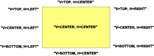
In the preceding class definition, vertical and horizontal alignment properties specify how a icon/text composite is laid out within a component's bounds. These properties are are just a straightforward superset of what the JDK1.1 Label component provides. Note that for backwards compatibility, the Label component continues to support a property called alignment which is equivalent to horizontalAlignment. The diagram below shows the various positions of the icon/text composite for all of the alignment combinations:
[V=TOP, H=LEFT]       [V=TOP, H=CENTER]       [V=TOP, H=RIGHT]
[V=CENTER, H=LEFT]    [V=CENTER, H=CENTER]    [V=CENTER, H=RIGHT]
[V=BOTTOM, H=LEFT]    [V=BOTTOM, H=CENTER]    [V=BOTTOM, H=RIGHT]
In the diagram, [V=VX, H=HX] represents the text/icon
composite. VX is the value of the horizontalAlignment
property, and HX is the value of the verticalAlignment
property.
The position of the single line of text relative to the position of the icon is specified by the text position and text Position properties. The diagram below shows the various positions of the icon/text composite for all of the alignment combinations.
In this diagram, the box represents the icon and "V=VX,
H=HX" represents the text. HX is the
value of the horizontalAlignment property, and VX
is the value of the verticalAlignment property.
Version 0.5. Last modified 10/1/97.
Copyright © 1995-97 Sun
Microsystems, Inc. All Rights Reserved.