
 Swing JavaDoc APIs JDK 1.1.4 Documentation
JDK 1.1.4 Download
JFC
Web Site README
Designing a good user-interface toolkit is a complex operation -- especially in this age of cross-platform programming. To develop programs that can be written just once and can then run anywhere, programmers need a flexible set of user-interface (UI) components that are both configurable and extensible, as well as a comprehensive infrastructure for managing input and output effectively.
Swing addresses this problem using a small set of design techniques that come from two main sources: the Java Beans model (which addresses the need for component properties, persistence, and event-based communication), and a new kind of pluggable look-and-feel mechanism for designing components. With Swing's L&F design tools, you can create components that not only can be used without modification on different computer platforms, but even have the same look and feel as components that were designed specifically for those platforms.
Swing's pluggable look-and-feel capabilities are described in more detail on the preceding pages of this document ("Introducing Swing" and "Swing Overview." This document explains how the Swing design team developed a set of components with pluggable-L&F capabilities using a modified form of a well-known kind of component architecture called the model-view-controller architecture, or MVC.
You don't have to know exactly how MVC-based components work in order to to use the pluggable-L&F features of the components provided in the Swing set. But a basic understanding MVC architecture can help you understand why Swing components work the way they do, and how they can be used most efficiently in your applications. And if you ever want to create a customized Swing component that has all the features and capabilities of the predesigned components provided in the Swing set, it will definitely help you to have a knowledge of the modified kind of MVC architecture that helps to give Swing components their pluggable-L&F capabilities.
How MVC Architecture Works
In the classic model-view-controller design, every component is divided into three parts -- a model part, a controller part, and a view part. These three parts, and their connection paths, are shown in the following illustration.
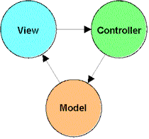
Briefly, this is how MVC architecture works in Swing:
- The model part of an MVC-based component provides information
that can be used to specify the component's value, provided the component
has any value properties. For example, the current value of a scrollbar
or a slider control -- as well as the component's minimum possible value
and maximum possible value -- are stored in the component's model part.
(Some components do not have properties that can be stored as values, and
those kinds of components do not have models. For example, a scrollpane
component has no model.)
- The controller part of an MVC-based component modifies information
maintained by the the component's model part in response to input from
the user. For example, the controller part of a menu-item component notifies
the component's model part when a mouse click is detected inside a given
menu item.
- The view part of an MVC-based component manages the way in which the object is drawn on the screen. For example, if you equipped an application with a Windows-95 style menu bar and then wanted to change that menu bar's appearance to make it look more like a Solaris-style menu bar, you would perform that operation by modifying the view part of your menu-bar component. (You'll learn more about how this kind of operation works under the heading Examples: Sample Swing Programs, presented later in this document.)
Advantages of MVC-Based Architecture
To change the appearance of an MVC-based component, all you have to change is its view part. To change the way it responds to user events, all you have to change is its controller part. In this way, you can equip a component with multiple appearances, multiple behaviors, or both, without disturbing the component's underlying architecture.
MVC architecture also makes it easy to change or extend the characteristics or capabilities of any pre-existing view or controller, without disturbing other parts of the component that is being modified.
Finally, MVC architecture lets you design components with appearances and behaviors that can be changed at any time -- not just at design time, but also dynamically, while the application that uses your component is actually being executed.
Later in this document, under the heading Examples: Sample Swing Programs, you'll learn more about how Swing's pluggable-L&F capabilities rely on the features of MVC component design.
Modifying the MVC Design
Although classic MVC architecture (the kind that has just been described) meets the overall needs of Swing components quite well, designing completely separate views and controllers for a component can be a difficult task. The main reason this is true is that the communication paths between the view part and the controller part of a component can quickly become quite complex and difficult to manage, as shown in the following diagram.

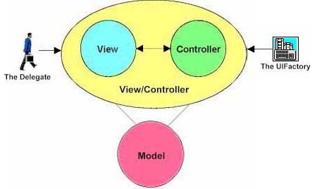
To simplify the communications-path jumble shown in the preceding diagram, the Swing design team made a small modification in the classic MVC design that has also been made by designers of other component sets: They combined the view and controller parts of the classic MVC design into a single element called a view-controller. The following diagram shows how the view and controller parts of a Swing component are combined to form a combined view/controller element:
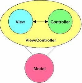
In the component represented by this diagram, notice that a simple two-way arrow represents the connection paths between the component's view and component parts. There's no jumble of arrows here because the view/controller part of the component handles all communications between the view and controller parts. That means that your application doesn't have to be concerned with them at all.
Another major benefit of combining a view and a controller into a single view-controller object is that both the appearance and the behavior of a component -- that is, a component's look and feel -- can be managed together, using just one view-controller object. If Swing used the classical MVC model, which requires a view and a controller to be two separate elements, the look and feel of each Swing component would have to be managed separately. That requirement would make it more difficult to implement Swing's pluggable-L&F capabilities.
In the section headed, "The UI Factory," you'll see how a view-controller element manages both the view part and the controller part of a Swing component.
The Delegate
As mentioned earlier, in the second "Overview" page, a major component of Swing's pluggable L&F mechanism is a user-interface (UI) object called a delegate. This delegate -- the "VC" portion of the MVC design -- is what combines the view part of a Swing component with its controller part. In that important double role, the delegate provides most of the functionality of the view/controller part of every Swing component.
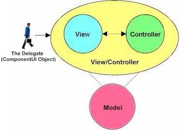
The delegate is the part of a Swing component that provides the kind of flexibility that it takes to create GUI tools for pluggable-L&F capabilities. The delegate also provides Swing components with hooks to simplify the testing of components and make them more easily accessible to users with special physical needs.
In the JFC library, the delegate is instantiated from a class named the ComponentUI class. You can change the look and feel of an individual component by by calling the ComponentUI class's setUI()method. The setUI()method changes component's UI delegate property.
The UIFactory
In an application that uses Swing components, an object called a UIFactory creates UI delegates for components by instantiating ComponentUI objects. The following illustration shows in a stylized way how a UIFactory object fits into the overall architecture of a Swing application. The icon on the right represents a UIFactory object.
Because the UIFactory takes care of most of the boring details that are involved in creating view-controllers for Swing components, you can equip the Swing components in your application with a complete set of UI classes for a particular look and feel by simply calling a method named setUIFactory() and providing it with a couple of parameters. This is an example of a setUIFactory()call:
   UIManager.setUIFactory
      (factoryName, (Container)frame);
When you call setUIFactory() to set up a UIFactory for a collection of components, you provide the setUIFactory() method with the name of the UIFactory you want to use and the name of the container that you want to use for your components. The section headed "Example: Using UI Classes," you'll see how the preceding method call works in a real application.
For more detailed information on the UI factory and how it works, see the specification titled "The UIFactory Class."
Creating UI Objects
Once an application has set up a UIFactory, the application can request
a new user-interface object by calling the UIFactory.getUI()
method. In response, the UIFactory dynamically loads the requested UI class
and creates a view-controller object for that class by calling the createUI()
method. Here's an example of how an MVC component can obtain a UI object
from the default factory:
ComponentUI ui =UIManager.getDefaultFactory().getUI("Foo", "my.pkg.DefaultFooUI"));
The getUI() method takes two parameters: a name and a default
implementation class. The name argument
is a name suitable for display by builders, such as "Button,""ScrollbarUI,"
or "Chuck's Widget." The default implementation class specifies
a class to use to instantiate the UI object if the UIFactory doesn't know
how to create a UI object for the requested widget.
Different
Factories for Different L&Fs
If you want to create components that have more than one look and feel, you must use a separate UIFactory for each additional look and feel that you want to create. That's because a single UIFactory can manage only a single set of ComponentUI objects that have the same look and feel. Sets of components with additional L&Fs require additional UIFactories. (For an example of an application that is equipped with multiple L&Fs, see the SwingSet example program in the examples folder that is provided with Swing.)
When the time comes for an application to create a set of Swing components, the application sets up a UIFactory by calling the setUIFactory() method. Then, each time the application needs to create a component, it requests the current UIFactory to create a ComponentUI object by calling getUI(). The component then uses the ComponentUI object that has been created to initialize its UI property. You'll see exactly how all this works in the next subsection, "Example: Using UI Classes."
For a closer look at UIFactories and how they work, see the specification sheet named "The UIFactory Class."
Example:
Using UI Classes
When you want to change the look and feel of all Swing components in an application, you can set the application's default UIFactory by calling the UIManager class's setUIFactory() method, as shown in Listing 1.
Listing 1: The SimpleExample Program
/** An ActionListener that listens to the radio buttons. */

class RadioListener implements ActionListener {
public void actionPerformed(ActionEvent e) {String factoryName = null; if (e.getActionCommand() == rose) { factoryName = "com.sun.java.swing.rose.RoseFactory"; } else { factoryName = "com.sun.java.swing.basic.BasicFactory"; } try { UIManager.setUIFactory (factoryName, (Container)frame); frame.pack(); } catch (ClassNotFoundException cnf) { System.err.println("could not load factory: " + factoryName)}
    }
}
As you can see, the code fragment in Listing 1 defines a class named
RadioListener, which is derived from the ActionListener class. The code
fragment shown in the example is taken from a sample program named SimpleExample.java,
which you can find in its entirety in the examples folder that comes with
Swing.
The SimpleExample.java program, and the code shown in Listing 1, are examined in more detail under the next heading.
How the Example Program Works
When you execute the SimpleExample.java program, it displays a window similar to this:
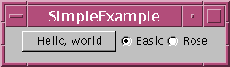
As the picture shows, the SimpleExample program's window contains three buttons: a button labeled "Hello, world," which does absolutely nothing but click, and a pair of radio buttons: one labeled "Basic," and one labeled "Rose." (In this preliminary release of Swing, the word "basic" is used to describe components with a Windows 95-style look and feel, which "Rose" (named after Chester Rose, its creator) is used to describe Solaris-L&F components.)
When the user clicks the "Basic" button, all three buttons in the program's window take on a Windows 95 look. When the "Rose" button is clicked, all three buttons shift to a Solaris-style look and feel.
In a nutshell, here's how the SimpleExample program works:
When the "Basic" radio button is clicked, the application uses the UIManager.setUIFactory() method to set the program's default UIFactory object to a preprogrammed UIFactory named BasicFactory (which is defined in the com.sun.java.swing file). When the user clicks the "Rose" radio button, the application calls the UIManager.setUIFactory() method, which sets the default UIFactory object to a preprogrammed UIFactory named RoseFactory, and the program's Solaris-like look and feel is activated. (RoseFactory is also defined in the com.sun.java.swing file.)
This is the section of code that determines which radio button the user has clicked:
String factoryName = null;

if (e.getActionCommand() == rose) {
   factoryName =
     "com.sun.java.swing.rose.RoseFactory";
} else {
   factoryName =
      "com.sun.java.swing.basic.BasicFactory";
}
When that section of code has been executed, the program sets the default UIFactory to the one the user has chosen:
try {
   UIManager.setUIFactory
      (factoryName, (Container)frame);
   frame.pack();

} catch (ClassNotFoundException cnf) {
      System.err.println("could not load factory: "
         + factoryName)
}
We've now introduced all the concepts you'll need to understand how the parts of a Swing component fit together. Now, to illustrate how all these components fit together, we'll sketch the creation and implementation of a fictional component called JWidget.
To construct a JWidget object, you can use a typical Swing component constructor like the one shown below. In this example, the UIFactory.getUI() method returns an implementation of the ComponentUI interface called WidgetUI.
public JWidget() {
    UIFactory factory = UIManager.getDefaultFactory();
    String fallbackUI = "com.sun.java.swing.BasicWidgetUI";
    WidgetUI widgetUI =
	   (WidgetUI)factory.getUI("WidgetUI", fallbackUI,
       this);
    this.setUI(widgetUI);
}
How a ComponentUI Object Works
Architecturally, a ComponentUI object is a look-and-feel-specific view/controller to which Swing components delegate the tasks of rendering, sizing, and performing input and output operations. For example, the JButton class delegates methods such as paint() and getPreferredSize() to a ComponentUI object that knows how to render a button and how to compute its preferred size.
This is how the ComponentUI interface is defined in Swing:
public interface ComponentUI
{
    void installUI(JComponent c);
    void uninstallUI(JComponent c);
    void paint(Graphics g, JComponent c);
    Dimension getPreferredSize(JComponent c);
    Dimension getMinimumSize(JComponent c);
    Dimension getMaximumSize(JComponent c);
    Insets getInsets(JComponent c);
}
Before you finish this page, you'll understand the semantics of the ComponentUI methods shown in the preceding code fragment. For the moment, the most important thing to note about ComponentUI objects is that ComponentUI implementations are L&F-specific. For each look and feel a component supports, there's a corresponding ComponentUI implementation class.
Generic and Specific Views
For example, the controller part of a ListBox component needs to know a great deal about the ListBox's view part to interpret incoming mouse and keyboard events correctly. This requirement can make it difficult to design an API for a completely generic view or a completely generic controller: that is, an API that is not biased towards a particular view or controller implementation, yet does not rule out any reasonable alternative implementation.
The Five Parts of the JWidget Component
When you create a JWidget component using this constructor, the object that you instantiate has two properties -- named label and color -- plus an actionListener that runs when the mouse is clicked inside the component it.
Altogether, the JWidget class that we will construct in this section has five parts:
- The component class itself (JWidget).
- An L&F-specific delegate interface named WidgetUI.
- A Windows 95-style implementation, named BasicWidgetUI.
- A model interface named WidgetModel.
- An implementation name JWidgetModel.
Definition of the JWidget Class
This is the class definition for JWidget:
class JWidget extends JComponent {
    WidgetUI getUI();
    void setUI(WidgetUI x):

    WidgetModel getModel();
    void setModel(WidgetModel x);

    String getLabel();
    void setLabel(String x);

    Color getColor();
    void setColor(Color x);

    void addActionListener(ActionListener x);
    void removeActionListener(ActionListener x);
}
All Swing components extend the JComponent class, which is a subclass of java.awt.Container. The JComponent class includes some common infrastructure for all Swing components, as well some utility methods.
How Much More Do You Want
to Know?
The JWidget class provides as much detail as many developers will need to know about Swing components in order to use them. If you don't care to learn about any more than that, you can treat the JWidget class just like any AWT component. But developers who want to create new Swing components that take advantage of Swing's pluggable-L&F capabilities will need to understand a little more. It is for that audience that we will now say a little more about how a component like JWidget is put together.
WidgetModel and JWidgetModel
Every Swing component has a model property, defined by getModel() and setModel(), that defines the component's non-view-specific state. For example, the JScrollBar model defines a scrollbar's current value, its extent, and the minimum and maximum limits for its value. The JScrollBar model doesn't include properties that are view-specific, such the color of the scrollbar thumb.
All Swing models are defined by an interface, and model implementations have the same name with a "J" prefix attached.
interface WidgetModel {
    boolean getState();
    void setState(boolean x);
    addChangeListener(ChangeListener x);
    removeChangeListener(ChangeListener x);
}

class JWidgetModel implements WidgetModel {
      // ...
}
The JWidget class deals with listening to the model and dispatching changes to its ActionListeners. The JWidget.setModel() method takes care of installing a listener on the model:
class JWidget extends JComponent {

    // ...

    protected actionListener = null;
    protected ChangeListener changeListener =
	   createChangeListener();

    public void setModel(Model newModel) {
	Model oldModel = getModel();
	if (oldModel != null) {
	    oldModel.removeChangeListener(changeListener);
	}
	model = newModel;
	if (newModel != null) {
	    newModel.addChangeListener(changeListener);
	}
}

protected class JWidgetChangeListener
    implements ChangeListener {
public void stateChanged(ChangeEvent e) {
	    if (getModel().getState()) {
		   if (actionListener != null) {
		       ActionEvent =
			      new ActionEvent(this, 0, "", 0);
		          actionListener.actionPerformed
		           (ActionEvent);
		   }
	    }
	}
    }

    ChangeListener createChangeListener() {
	return new ChangeListener();
    }
}
As you can see, the JComponent class itself listens to the model and runs its actionListeners whenever the state of the model changes to true.
WidgetUI and BasicWidgetUI
All Swing components have a UI property, defined by getUI() and setUI(), whose value is an L&F-specific ComponentUI object. The type of the JWidget UI property is WidgetUI, an interface that extends ComponentUI for the sake of type safety. The Windows 95-style implementation of WidgetUI is called BasicWidgetUI.
interface WidgetUI extends ComponentUI { }

public class BasicWidgetUI implements WidgetUI {
    public void installUI(JComponent c);
    public void uninstallUI(JComponent c);
    public void paint(Graphics g, JComponent c);
    public Dimension getPreferredSize(JComponent c);
    public Dimension getMinimumSize(JComponent c);
    public Dimension getMaximumSize(JComponent c);
    public Insets getInsets(JComponent c);

    public static WidgetUI createUI(JWidget x) {
	return new BasicWidgetUI();
    }
}
The WidgetUI installUI() and uninstallUI() methods are responsible for adding behavior and structure to the raw JComponent. The component that's delegating to a ComponentUI object calls installUI() to give it an opportunity to add listeners, perhaps to set the layout manager, and perhaps also to add children to the JComponent. Similarly, the uninstallUI() method is responsible for removing the same listeners and children. It's called when the ComponentUI delegate is replaced or set to null.
Here's an example of the implementation of installUI() and uninstallUI() for BasicWidgetUI. A few details are worth noticing:
- Changes in the model are reflected in the JWidget by calling repaint.
- Listeners' classes are created by idiomatic methods called createX(). This feature allows a subclass to
override the listener classes installed by installUI().
- In all cases, the JComponent argument passed to a ComponentUI method can be safely cast to the component type. For example, the methods in an implementation of WidgetUI can safely cast their arguments to JWidget.
public class BasicWidgetUI implements WidgetUI
{
    protected JWidget widget;
    protected MouseListener mouseListener =
	createMouseListener();
    protected ChangeListener changeListener =
	createChangeListener();

    public void installUI(JComponent c) {
	widget = (JWidget)c;
	widget.addMouseListener(mouseListener);
	widget.getModel().addChangeListener
		(changeListener);
    }

    public void uninstallUI(JComponent c) {
	widget.removeMouseListener(mouseListener);
	widget.getModel().removeChangeListener
		(changeListener);
        widget = null;
    }

    class WidgetMouseListener extends MouseAdapter {
	public void mousePressed(MouseEvent e) {
	    widget.getModel().setState(true);
	}
	public void mouseReleased(MouseEvent e) {
	    widget.getModel().setState(false);
	}
    }
    MouseListener createMouseListener() {
	return new WidgetMouseListener();
    }

    class WidgetChangeListener implements ChangeListener {
	public void stateChange(ChangeEvent x) {
	    widget.repaint();
	}
    }
    ChangeListener createChangeListener() {
	return new ChangeListener();
    }

    // paint(), getPreferredSize(), etc..
}
The other methods used by ComponentUI have the same semantics as their counterparts in java.awt.Component. The corresponding methods in JComponent delegates to them. For example, JComponent.paint() looks like this:
    public void paint(Graphics g) {
	if (ui != null) {
	    ui.paint(g, this);
	}
	super.paint(g);  // paint children if any
    }
The BasicWidgetUI.paint() method uses the component properties (for example, JWidget.getLabel()), as well as the model's state, to render the widget component. For example:
class BasicWidgetUI implements WidgetUI
{
    // .. install(), deinstall(), etc..

    public void paint(Graphics g, JComponent c) {
	   JWidget widget = (JWidget)c;
	   Dimension size = widget.getSize();
	   WidgetModel = widget.getModel();
       Color color = model.getState())
	     ? widget.getColor() : Color.black;
       g.setColor(color);
       g.fillRect(0, 0, size.width, size.height);
       g.drawString(widget.getLabel(),
		  0, size.height / 2);
    }
}
The geometry methods, such as getPreferredSize(), are similar. They compute their value based on the current state of the model and the JWidget itself.
As we saw earlier, when a Swing component is constructed,it initializes its UI property by asking the current UI Factory to create a ComponentUI object. The UIFactory contains a table that maps from ComponentUI interface names to ComponentUI implementations. (Currently, the table is initialized from a file; for details, see the specification titled "The UIFactory.") The BasicFactory, which manages all of the Windows 95-style ComponentUI delegates, contains a table entry like this:
WidgetUI = com.sun.java.swing.basic.BasicWidgetUI
So when the JWidget constructor calls UIFactory.getUI(),
factory.getUI("WidgetUI", fallbackUI, this));
The UIFactory (lazily) loads the BasicWidgetUI class and then returns the value produced by its static createUI method like this:
return BasicWidgetUI.createUI(widget);
The JWidget component uses the new BasicWidgetUI object to initialize its UI property by calling setUI(). This is a method provided by JComponent that handles calling installUI() and uninstallUI() to take care of removing all traces of the old UI delegate and installing the new one. The JComponent.setUI() method looks like this:
protected void setUI(ComponentUI x) {
	if (ui == x) {
  	    return;
  	}
	if (ui != null) {
	    ui.uninstallUI(this);
	}
	ui = x;
	if (ui != null) {
	    ui.installUI(this);
	}
   invalidate();
}
That completes the picture: The JWidget component delegates painting, geometry and input handling to its L&F-specific WidgetUI delegate. You can change the JWidget's look and feel at any time by setting its UI property.
 |
 In the
examples folder that's shipped with this release, there's an impressive
sample application named SwingSet that demonstrates the creation
and use of almost every Swing component. There's also a much shorter, considerably
less ambitious "Hello, world"-style program in the examples folder.
Named
In the
examples folder that's shipped with this release, there's an impressive
sample application named SwingSet that demonstrates the creation
and use of almost every Swing component. There's also a much shorter, considerably
less ambitious "Hello, world"-style program in the examples folder.
Named SimpleExample.java,
it shows how to create a very simple program that displays three buttons
and lets the user change their look and feel. The operation of this application
was examined earlier on this page, under the heading "Example:
Using the Component UI."
Another very short sample program, named SwingApplet.java, shows
how to place a Swing component in an applet.
There are also several other sample programs in the examples folder.
Version 0.5. Last modified 10/1/97.
Copyright © 1995-97 Sun Microsystems, Inc. All Rights Reserved.